5 BIG DESIGN LESSONS FROM OUR #SpringIntoHome TOURS
For the past five Fridays, myself and design darlings Doreen Corrigan, Bria Hammel, Claire Staszak, and Meredith Rodday, have opened the doors to our homes and invited you in to have a look around! Through our respective home tours we've dubbed with the hashtag #SpringIntoHome, we've shared tips on getting your home ready for spring and some of our personal stories behind the spaces where we live (and work!). Don't worry, the links to each of the home tours are at the bottom of the post for you in case you missed a few!
In rounding out our #SpringIntoHome series, I thought I would draw some attention to five specific design lessons we can learn from my talented colleagues (that they're using in their own homes!) and I'll share one of my own as well! Let's start with our very first tour of the series, Doreen Corrigan:
LESSON ONE: ON STYLING...

You know when you have accessories like framed family photos, vacation mementos, or handed-down heirlooms that you want to display, but struggle to somehow put it all together so it doesn't look like a cluttered mess? Let's take a page from Doreen's book and look at her living room built-ins. Here's why it works + how you can get the look:
- Choose pieces that are in the same general color scheme. In this case Doreen chose soft pastels and neutrals that have the same color tones and each item works well with the one next to it
- Vary the size and shape. Doreen mixed in some smaller pieces with the larger ones to keep things feeling balanced and proportioned. Adding in a unique shape such as
- Add in texture and interest. Notice the different materials? Wood, ceramic, glass, metal, + more keep things interesting to look at and lets each item stand on its own. When I see bookshelves like Doreen's, I can't help but imagine the stories and memories behind each item
- Incorporate something living like a plant or cut flowers. In this vignette, the orchid adds a certain softness and injects life into the space
And last but not least...
- Add something black! Black is a strong color that provides contrast and punctuation to the other items. Lovely Doreen!
On her blog, Doreen shares her own five tips for the perfect shelfie. Her first thought is my favorite: 'Use what you love' - so important!
LESSON TWO: ON PROCURING PATTERNS...

Bria, Bria, Bria... this lady has a super strong pattern game (as evidenced in many of her projects) and today I thought we'd look at her living room chair situation for an example of how to mix patterns like a pro. There are no hard and fast rules here but I'll share some tried and true suggestions that seem to work every time:
- Vary the type of patterns you're using. Think of them in a few main categories... geometric, floral, stripes, artist, and solid. Here Bria used a navy buffalo check on the chair, a floral on the large pillow, and two solids. A thoughtful variety will help the eye focus on each unique piece, distinguishing one from another.
- Also vary the scale of patterns used. Simply put, 'scale' refers to how often the pattern repeats. The chair is a large scale pattern, the floral pillow is a more medium scale, and the solid is very minimal as the pattern has a small repeat. If that patterns you put together are all large scale they will take away from each other. All small scale and the look can feel fussy.
- Pull it together. Try to add in at least one pattern that ties all the others together in terms of color. In Bria's living room, the floral pillow combines the navy, pink, white, and grey seen in the other patterns. Looks great Bria!
LESSON THREE: ON MIXING METALS...

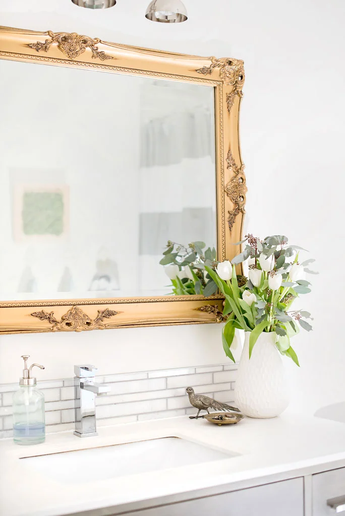
My home was the third in the tour and when I posted this photo to our Instagram page, a lot of the comments were geared towards the mix of metals in this room. The brass mirror is a little unexpected but here's why I think it works:
- Master the mix. Rather than adding metals in any and every color, stick to two or three per room for a clean look. In our bathroom, I used only two metals: brass and chrome. Another trick is to keep them in the same finish in terms of sheen - for example, try mixing brushed gold with stainless steel or polished brass with chrome for a cohesive feel
- Weight it out. Think about how the room is weighted in each metal. For example, are you using 90% chrome and 10% brass? 70/30? In this case, the mirror is the only brass piece in the room while the rest of the fixtures are chrome. My personally favorite looks seem to have an offset mix, like I created here
- Stick to one statement piece and let it take center stage. The mirror is definitely the strongest piece in the room visually and holds presence just by where it's placed so it was the perfect piece to do in a different metal.
Mixing metals is a trick and one that often stresses clients. Don't be afraid to try it on your own or book a consult with us if you get stuck!
Our bathroom underwent a huge transformation when we renovated three years ago - you should see the 'before' pics!
LESSON FOUR: ON WORKING WITH WHAT YOU HAVE...

Claire's historic Tudor-style home had great bones but some rooms needed a bit of a refresh. Before doing a complete overhaul, Claire evaluated what she loved about the house and decided what she wanted to incorporate into her new design. Here's why her entryway is a perfect example:
- Play up unique features. Claire home's already had this awesome arched front door and, rather than replace it, she gave it a fresh coat of paint so it would work with her new design plan. Now it's a beautiful feature!
- Consider the architecture of your space. Throughout their renovation, Clare made design choices that respect her home's existing architecture - from the layout to the furniture and color palette - her home flows graciously from one room to another making it tricky to discern what's new and what's an original element to the space. Would you guess the tile floor in the entry was an existing element that Claire incorporated into the design? Adding a few new pieces like the Moroccan-style lantern and fun wallpaper make the whole space feel new. Great job Claire!
Claire is in the midst of documenting their renovation as they complete each room and you can follow along with her 'Warwick Reno' from start to finish through her blog - the transformation is so fun to watch!
LESSON FIVE: ON TAKING IT UP A NOTCH...

Meredith held the final home tour in our #SpringIntoHome series and I don't think we could have ended on a better note! Her home was a new build and she shared several ways she upgraded some of the basics elements of her home to achieve that custom feel. Her powder room is just one of the rooms where she took it up a notch in terms of design. Here's why it works:
- Watch the walls. Adding colourful, patterned wallpaper to an otherwise neutral space is an impactful (and often inexpensive) to up the wow-factor.
- Faucets + Fixtures can totally change a room. By switching out most of the light fixtures in her home to those of her choosing, Meredith was able to achieve a unique mood in each room that still flows through the house. Lighting is one of my favourite design elements to work with because it makes such a huge difference, both in style and function, and can really change the entire feel of a room!
- It's all in the details. The custom vanity with an extra-thick, marble slab coutertop and detailed legs lend the room a bespoke feel. Oftentimes, the extra details aren't a huge added cost, it simply takes working those intentional details into the design in advance, like Meredith did
Since our home tour, Meredith has shared a more detailed look at several rooms in her home including her living room and her office.
That wraps up our Home Tour series, #SpringIntoHome! I hope you enjoyed catching an inside look into five different homes in across Canada + the US and were able to take away a tip or two from today's post! I just have to say, I've thoroughly enjoyed getting to know each of these amazing ladies, either in person at the Design Bloggers Conference or through our home tours - at the end of the day, all of this is truly about people, right?